kristal.ai
2023
Reducing Drop-Offs in a High-Stakes Cash Flow
Cash movement is a business-critical journey in fintech.The existing flow caused confusion and abandoned transactions.
This revamp was designed for clarity, confidence, and completion.




My role
Product Designer - User Research, Conceptualisation, UI/UX Design, Prototyping, Developer-Handoff
Team
Led this project with a team of 2 designers, 1 Product
Manager, 4 Engineers
Timeline
6 Weeks,
Why This Project Mattered
In fintech, friction doesn't just annoy users—it scares them. When a user moves large sums of money, a confusing interface isn't a usability issue; it’s a trust violation.
At Kristal.ai, our cash transfer flow was suffering from a critical disconnect. We had 24 fragmented transfer variations across different regions and client types. The result? High drop-off rates and a heavy reliance on Relationship Managers (RMs) to manually execute trades that users should have been able to do themselves.
My Goal: Transform a complex, anxiety-inducing administrative task into a transparent, self-service experience that empowers investors and frees up RMs for high-value advisory work.
Our approach
After conducting extensive desk research and speaking with Relationship Managers to understand the challenges our users were facing, we identified two distinct user personas with the respective problem statements:
DIAGNOSIS
Where Trust Was Breaking Down
Research into digital financial services shows that for users to trust a platform, the interface must provide visible security cues and clear confirmation of actions. Our existing flow failed these heuristics in three key areas:
• The "Backwards" Cognitive Load: The original flow forced users to fill in 10-15 input fields, often asking for the deposit amount at the very end. This created high cognitive load; users were doing data entry without knowing the context of the transaction.
• The "Blind" Transaction: Critical information—such as transaction charges and exchange rates—was missing or hidden. In the context of international transfers, transparency about fees is a primary driver of user trust and adoption.
• The "Application ID" Maze: We needed to introduce a new backend concept called "Application ID" (allowing users to have multiple account combinations). Without a clear design intervention, this added layer of complexity threatened to increase error rates.
User and their needs
CEO OF FINANCE COMPANY
Pain: The existing cash transfer flow doesn’t clearly communicate context, progress, or confirmation, making it difficult to confidently approve transactions.
Consequence: Uncertainty in high-value transactions increases reliance on manual support and delays important financial decisions.
Need: A guided yet transparent cash transfer flow that supports assisted decision-making while preserving her sense of control.
RETAIL INVESTOR
Pain: Complex and confusing cash transfer steps make even simple actions feel overwhelming.This prevents users from completing transfers independently.
Consequence: Friction in basic money movement discourages frequent engagement and reduces product usage.
Need: A simple, intuitive, and flexible cash transfer experience that enables quick self-service without requiring deep financial knowledge.
A Guided Financial Journey
Here's a glimpse into the modifications we implemented through the new flow, Taking example of Deposit Cash flow below.
https://portal.kristal.ai/cashtransfer/add/272

https://portal.kristal.ai/cashtransfer/add/272

OLD FLOW
NEW FLOW
Transfer Charges Not Mentioned
On this page the user is not aware of
the charges that he would be charged
on this transaction.
Wasted Whitespace
This page displayed
excessive whitespace on its
right side, resulting in fewer
details and input fields
visible on the screen. This
was leading to unnecessary
clicks and steps for the user.
Redundant
Information
Complex language and
surplus information led to
unnecessary confusion.
Incomplete
Information
The user here isn’t
aware as to in
which currency
cash will be
transferred.
Recent Deposits
Recent Deposit instructions
offer quick access to the
user's last two transactions.
Hierarchy
We've highlighted critical
elements like amount and
currency for greater
prominence, signifying their
importance. Furthermore,
we've introduced the
currency field, which was
previously absent.
Reduced Steps
By including these
fields here, we're
saving the user from
navigating to another
page with repetitive
questions.
Final Designs
After a lot of brainstorming, to and fro's and after considering all the use cases we came up with these designs. Below i have explained Cash Withdrawal Flow. We have worked on many flows in this project this is one of the flows which i

Introducing Application ID
When users click on the cash transfer option in the
dashboard, a pop-up appears, guiding them to select
the Application ID and the desired action. This method
ensures users understand which Application ID they're
working with in the first step itself.
Select Remmitance Bank
The initial step in the withdrawal process involves
selecting the remittance bank account . At this point,
users can view their pre-added banks.They also have
the option to add a new bank or remove an existing one
directly from this interface.
Recent Withdrawals
We've introduced a 'Recent Cash Withdrawals' section,
enabling users to track their past transactions and their
current status. For a complete transaction history, a
direct link to our reports section is also provided.


Main Withdrawal Page
Upon reaching the withdrawal page, users are
presented with their available balance right away. To
provide clarity, we've included a breakdown of this
balance in different currencies. Subsequently, we ask
for all the essential information required for the
withdrawal process.
Enter Amount
As users input the amount, the keypad opens
while the 'Available Cash for Investment' card
conveniently closes, ensuring users can
simultaneously view the entered amount,
currency, and related details at the top of the
screen.
Equivalent Amount in USD
For user convenience, if they request funds in EUR, we provide a quick estimate of the equivalent amount in
USD. This is aligned with our practice of displaying the available balance in USD.


Request Confirmation Page
Given our users' tendency for significant withdrawals, we've implemented a confirmation screen displaying key details such as amount, account, and the withdrawal process. This empowers users to review and validate transactions, reducing the likelihood of errors or accidental requests.
Request Status
To enhance user convenience, we've incorporated
two collapsible sections. The first section remains
closed by default to minimize scrolling. Users can
expand it at their convenience to access
comprehensive transaction details.
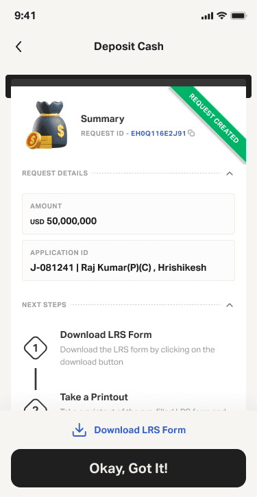
Success
After the user confirms the transaction with an OTP, they are greeted with a success animation followed by a detailed success screen. This screen includes request specifics for future reference, current request status, and any subsequent instructions needed, ensuring a comprehensive user experience.


The Impact
By restructuring the information architecture and prioritizing transparency, we moved the needle from "administrative data entry" to "empowered asset management."
• Operational Efficiency: By making the flow self-explanatory, we reduced the need for clients to email Relationship Managers for basic transfers, aligning with the business goal of reducing manual support dependency.
• Error Reduction: The introduction of the confirmation screen and pre-filled data fields minimized the risk of failed transactions due to user input error.
• User Confidence: The addition of clear success states and transaction trackers provided the "emotional design" elements necessary to build long-term retention and trust.
Reflection
This project reinforced that in fintech, clarity is the product. It wasn't just about making the UI "cleaner"; it was about understanding that for a user moving their life savings, clarity equals safety. By designing for the most anxious user—the one afraid of clicking the wrong button—we created a better experience for the expert user, too.