
askiitm
2025
Reorganizing Academic Queries into a Coherent, Guided System
Moving from scattered questions and informal workarounds to a unified, system-level approach for academic discovery

My role
Lead Product Designer - User Research, Conceptualisation, UI/UX Design, Prototyping, Usability Testing, Developer-Handoff
Team
Solo Designer with guidance
from a Lead Designer, 1 Product
Manager, 1 Engineer
Timeline
3 Weeks
The Problem: The "Black Hole" of Institutional Knowledge
IIT Madras holds a massive repository of academic knowledge, but it was suffering from a crisis of discoverability. The institute had thousands of hours of video content and PDF notices scattered across disparate servers.
The User Pain:
• Information Fragmentation: Students (and parents) couldn't find specific answers (e.g., "What are the exact credit requirements for the BS degree?") without wading through hour-long video lectures.
• Administrative Bottleneck: Faculty were overwhelmed answering the same repetitive questions via email because the "answers" existed but were inaccessible.
• The "Rumor Mill": Without an accessible single source of truth, students relied on hearsay for critical academic decisions.

This doesn’t change the language of the page, its a link to a different page with a set of videos with that language
Visibility issue
Constraints & Early Decisions
Constraint: We could not simply delete the legacy video content and start over. The sheer volume of data was too high, and the faculty time required to rewrite content was unavailable. Design Challenge: How do we make a "video-first" database navigable and searchable?
Phase I: The Thumbnail Intervention (Visual Signposting)
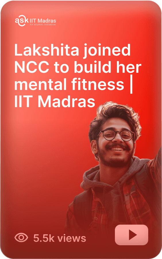
I realized that users were not engaging with content because the entry points (thumbnails) were generic.
• The Fix: I redesigned thumbnails to function as UI components rather than decorative art.
• The System: We implemented a visual hierarchy using color-coding and typography to indicate Topic, Difficulty Level, and Content Type (e.g., Tutorial vs. Announcement) at a glance.
• Outcome: This reduced the "click-and-bail" rate. Users could qualify the content's relevance before committing time to watch it
User and their needs
STUDENTS, ASPIRANTS, PARENTS
Pain: Students struggled to find accurate academic information quickly. Important details were spread across multiple sources, and informal peer responses often led to confusion or misinformation.
Consequence: Repeated follow-ups, missed deadlines, increased anxiety during critical academic moments, and lack of trust in the information received.
Need: A guided system that helps students ask clearer questions and receive accurate, consistent answers from a single, trusted place.
ADMIN & FACULTY TEAMS
Pain: Faculty and administrative teams received the same questions repeatedly through emails, messages, and in-person interactions, often requiring manual clarification each time.
Consequence: High operational overhead, delayed responses, and reduced time available for higher-value academic or administrative work.
Need: A centralized, scalable system that can handle routine academic queries reliably while maintaining institutional accuracy and reducing manual intervention.
The Pivot: From "Repository" to "Community"
Improving discoverability was only half the battle. Static content couldn't answer dynamic, personal student queries. We needed to transition from a unidirectional broadcast (Institute → Student) to a bidirectional community (Student ⇄ Faculty).
To achieve this, we needed a robust forum engine. We evaluated several options before selecting Discourse.
Competitive Benchmarking: Why Discourse?
Discourse offered the best balance between structure and flexibility.
It allowed AskIITM to:
Treat academic questions as evolving knowledge, not disposable chats
Maintain institutional authority over answers
Scale content without rebuilding core infrastructure
Layer a guided, student-friendly UX on top of a proven system

RESEARCH
Flow-Diagram
Ask IIT-M is designed as a guided, intent-first experience that helps users move from unclear questions to accurate, institutionally trusted answers. Users can begin by browsing structured categories or by searching directly, depending on how clear their intent is at entry.
By combining structured navigation, conversational guidance, and decision-based routing, the flow reduces confusion, avoids dead ends, and minimizes reliance on informal sources—ensuring students reach the right information quickly and reliably.

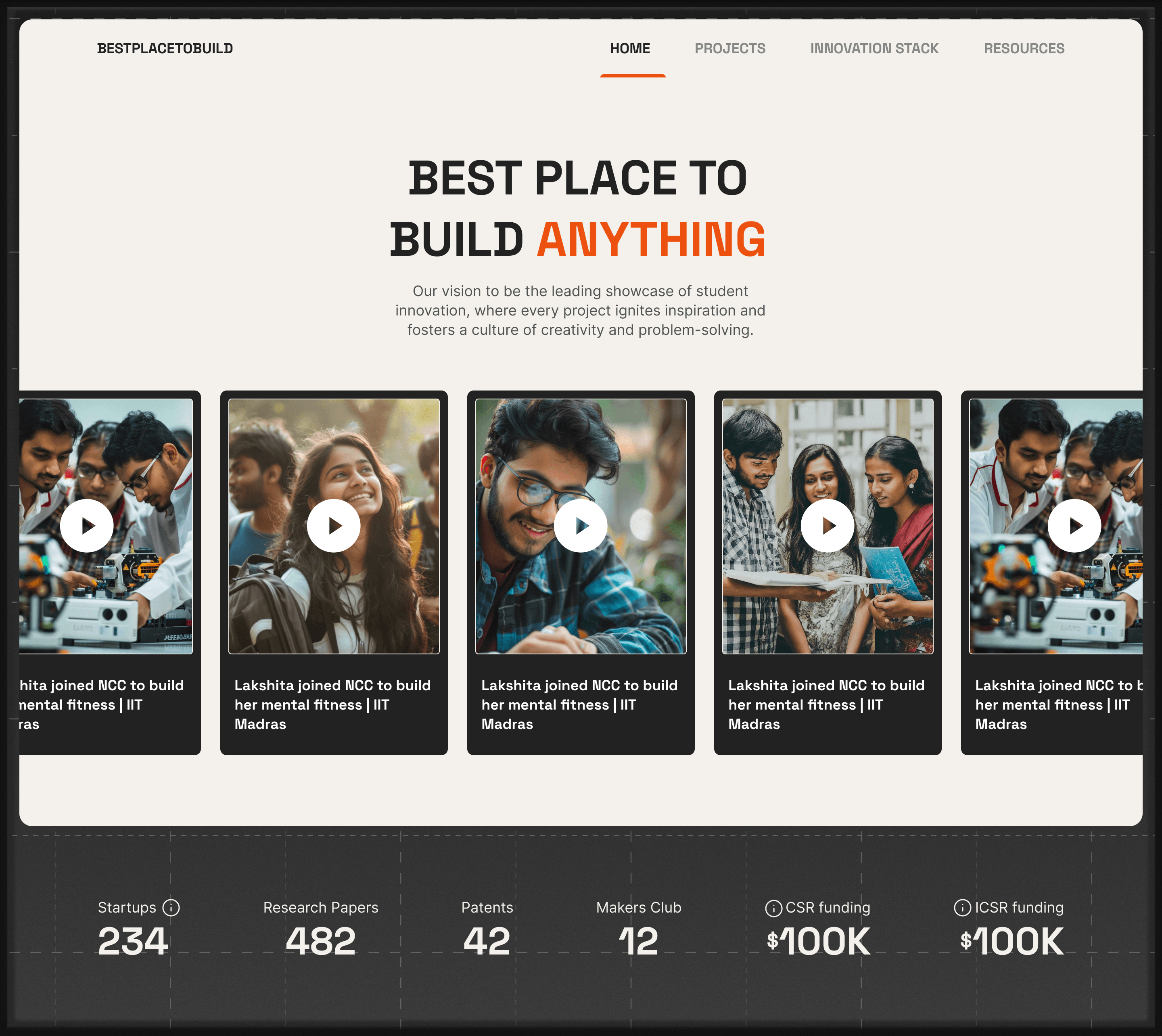
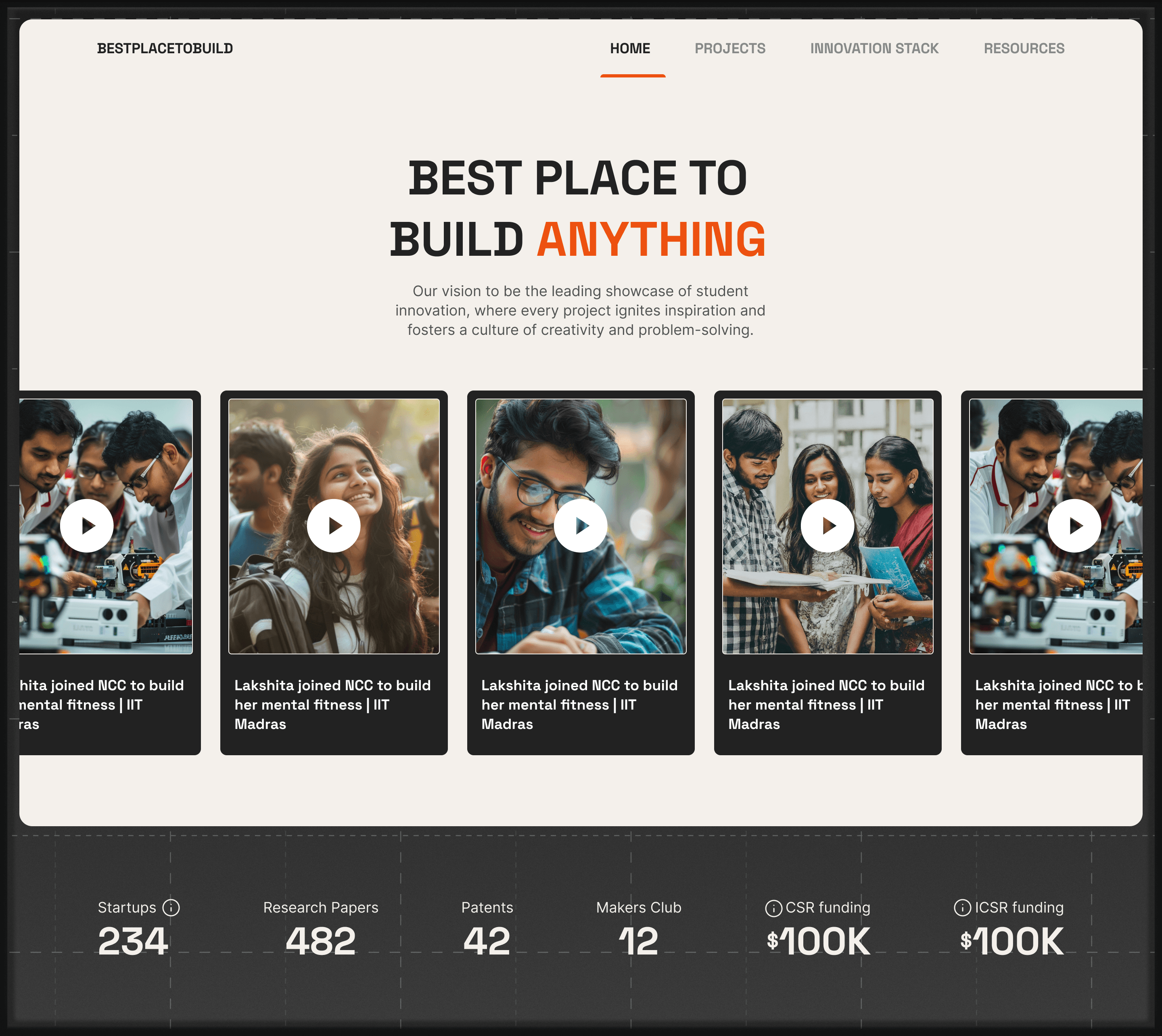
Closing the Loop: Bestplacetobuild.com
While AskIITM solved the input (queries), we noticed a gap in the output (achievements). Students were building incredible projects—Hyperloop pods, satellites, and sustainable engines—but these were invisible to the outside world.
The Solution: I designed a companion platform, "Best Place to Build".
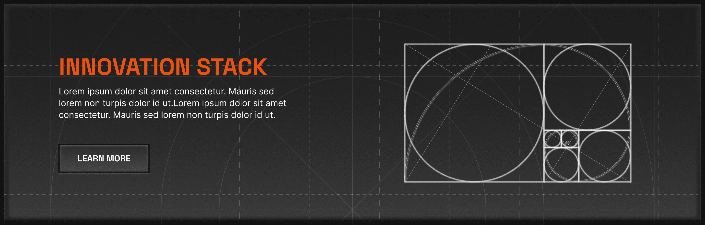
• Visual Language: Moving away from the "Academic/Institutional" aesthetic, I adopted an "Industrial/Maker" visual language. This framed student work not as homework, but as market-ready innovation.
• The Ecosystem Goal: The platform was architected to connect three user groups:
1. Students: Who need visibility and team members.
2. Faculty: Who need to track research output.
3. Alumni/Donors: Who want to fund specific, high-impact projects


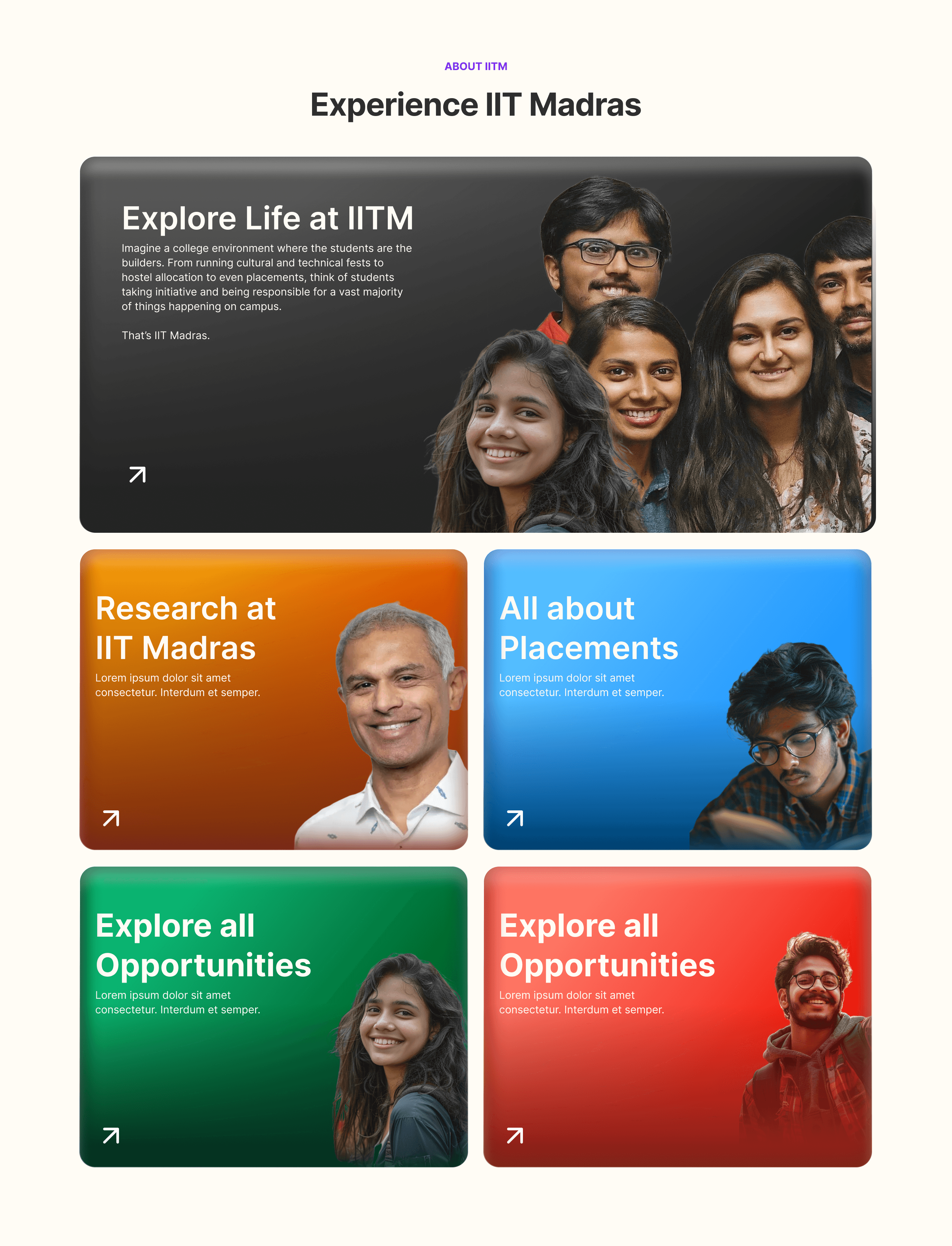
Other Screens


The Impact & Retrospective
This project was an exercise in Systems Design. We moved the institution from a state of "Information Entropy"—where data was lost in PDFs and rumors—to a state of "Structured Knowledge."
Key Outcomes:
• Reduced Anxiety: Students now have a single, trusted source of truth for critical deadlines and policies, reducing the "fear of missing out" (FOMO) and academic stress.
• Operational Efficiency: By using Discourse’s "Similar Topics" feature, we drastically reduced duplicate queries sent to the admin team.
• Scalability: The system now supports thousands of students across the BS Data Science and on-campus programs without requiring a linear increase in support staff.
Design Takeaway: The most effective design solution wasn't building a custom tool from scratch; it was identifying the right existing technology (Discourse) and designing a user-centric experience around it to solve a specific human problem.